The Political Geography of Cancer in the US
Recently I posted data graphics illustrating the Political Geography of Heart Disease in the US. This post will take the same approach to examine Cancer mortality in the US.
I won’t rehash my approach here. If you’re interested please go back and read the initial post.
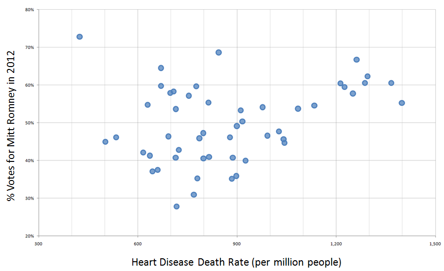
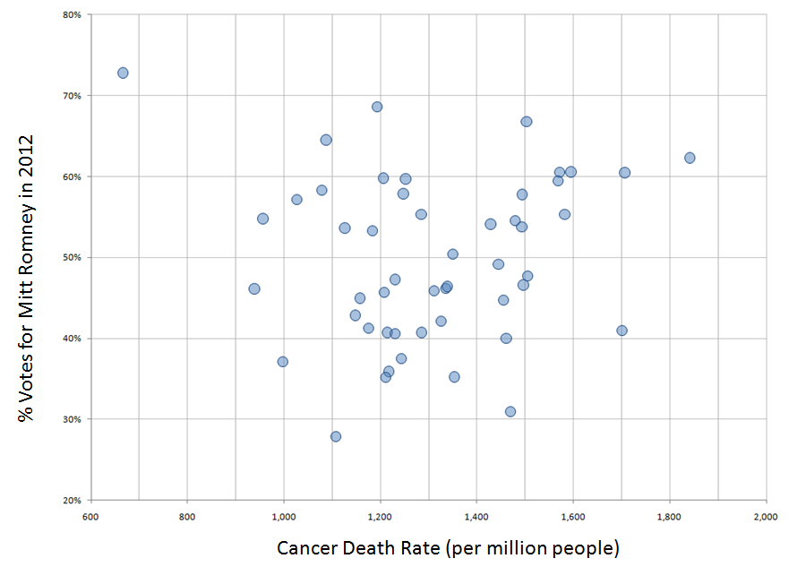
Here’s the scatter plot with Cancer Death Rate along the horizontal axis and % Voting for Mitt Romney along the vertical axis.
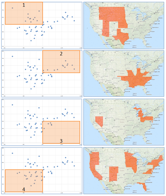
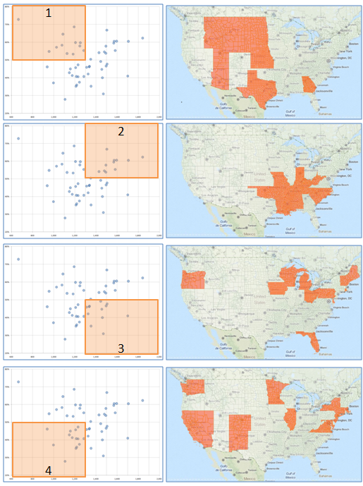
And here’s the breakdown by quadrant.
Quadrant 1 (upper left). These are politically conservative States (over 50% voted for Romney) with lower death rates due to cancer. States in Quadrant 1 include Alaska, Arizona, Georgia, Idaho, Kansas, Montana, Nebraska, North Dakota, South Dakota, Texas, Utah, and Wyoming.
Quadrant 2 (upper right). These are politically conservative States with higher death rates due to cancer. States in Quadrant 2 include Alabama, Indiana, Kentucky, Louisiana, Mississippi, Missouri, Oklahoma, North Carolina, South Carolina, Tennessee, and West Virginia.
Quadrant 3 (lower right). These are politically progressive States with higher death rates due to cancer. States include Delaware, Florida, Iowa, Maine, Michigan, Ohio, Oregon, New Hampshire, Pennsylvania, Rhode Island, Vermont, and Wisconsin.
Quadrant 4 (lower left). These are politically progressive States with lower death rates due to cancer. States include California, Colorado, Hawaii, Illinois, Maryland, Massachusetts, Minnesota, Nevada, New Mexico, New York, Virginia, and Washington.
Looking back at the same graphics for Heart Disease I see quite a bit of overlap. I plan to add posts for the other common causes of death and then I will do some sort of comparison/consistency analysis.
