Presidential Politics and the Gender Wage Gap in America
April 15, 2014
The Paycheck Fairness Act of 2014 was recently defeated in the Senate with Republicans voting unanimously against the bill. Conservatives at the Heritage Foundation argued the bill is based on faulty statistics, would hurt women’s employment prospects and invites too much government interference in the economy. On the other side of the political aisle, Democratic politicians and Women’s rights advocates argued it was a simple issue of fairness. I’m not familiar enough with the language in the bill to do any fact checking or know how it might improve upon or detract from the Equal Pay Act of 1963. In any case, I’m fairly confident both sides are misrepresenting the issue, making it difficult to have an open discussion. After all, it’s politics, right?
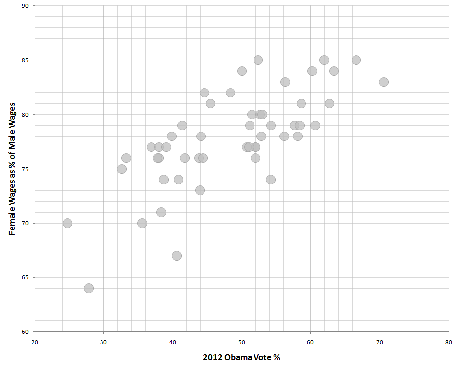
Out of curiosity I downloaded the State Gender Wage Gap data along with voting results from the 2012 Presidential Election in an effort to see how voting patterns correlated with wage gap data. As I tell my students, correlation does not imply causation so these data prove nothing. That said, there is a fairly strong positive correlation (Pearson Correlation Coefficient = 0.76) between % Obama votes and Female Wages as a % of Male Wages by State.
My wife tells me that I should restate the preceding sentence in plain English. Translation: States with a low percentage of votes going to Obama in 2012 are more likely to pay women less; likewise, States with a high percentage of votes going to Obama in 2012 are more likely to pay women more. Like I said, this relationship does not prove that political orientation causes wage discrimination. But, there is a correlation.
I’ve produced a scatter plot to help visualize the data relationship. Each circle below represents one State.
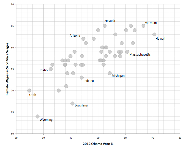
I plan to circle back on this topic to examine the geographical dimension. In the meantime, here is the same graph with a few labels.
5 Comments
[…] might express themselves through these health outcome data I decided to dig a bit deeper. Recently, I looked at Presidential Election voting percentages and compared them to Gender Wage Gap data. The results were intriguing so I’m taking a similar approach […]
[…] Gender Wage Gap […]
[…] Gender Wage Gap […]
[…] Gender Wage Gap […]
Could you please post the raw data for these scatter plots?