The Political Geography of Heart Disease in the US
May 21, 2014
As reported by several news outlets, the CDC recently published a report entitled, Potentially Preventable Deaths from the Five Leading Causes of Death – United States, 2008-2010.
The report includes tables with number of deaths for the 5 leading causes of death. They have some sort of formula for estimating number of “Deaths Expected” and then the authors compare those estimates to actual deaths to arrive at a number of “Potentially Preventable Deaths”. As I read about where preventable deaths were highest I couldn’t help but notice a familiar geographic pattern.
In order to see whether America’s cultural regions might express themselves through these health outcome data I decided to dig a bit deeper. Recently, I looked at Presidential Election voting percentages and compared them to Gender Wage Gap data. The results were intriguing so I’m taking a similar approach here.
Note: typically I don’t like to analyze State level data but in this case each State is both a health insurance regulator and a political actor. So here it makes sense.
First, I pulled in population counts and calculated death rates due to Heart Disease for each State. I decided simple mortality rates would suffice rather than using a more complex age-adjusted calculation. I realize this may produce some bias for States with older than average or younger than average populations. Since I’m not a slave to the silly world of academic/scientific publication I can do whatever I want. Na-nana-na-na. I don’t think it will make much difference.
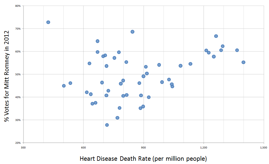
Then, I compared these death rates (deaths per 1 million people) with the percent voting for Mitt Romney in the 2012 Presidential Election by producing a scatter plot. I love scatter plots – don’t you? Here’s the resulting graphic with Heart Disease Death Rate along the horizontal axis and % Voting for Mitt Romney along the vertical axis.

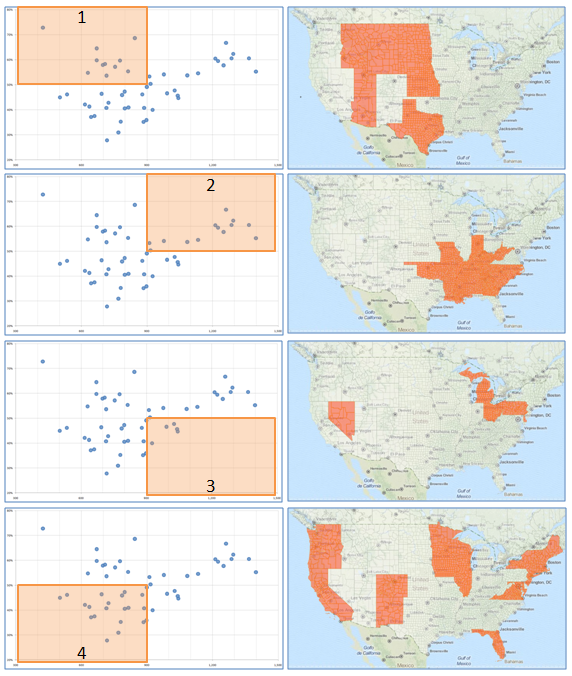
Now, I wish I had time to build a fancy cartographic brushing display so you could interact with the scatter plot and a map of the lower 48. Sadly, I don’t have so much time available so I’m providing a set of small multiple graphics to help you see what I’m seeing in this scatter plot. I could examine some of the closely clustered points to illustrate cultural homogeneity among several smaller groups of States but instead I’ve decided to simply divide the graphic into 4 quadrants.
Quadrant 1 (upper left). These are politically conservative States (over 50% voted for Romney) with lower death rates due to heart disease. States in Quadrant 1 include (in alphabetical order) Alaska, Idaho, Kansas, Montana, Nebraska, North Dakota, South Dakota, Texas, and Wyoming.
Quadrant 2 (upper right). These are politically conservative States with higher death rates due to heart disease. States in Quadrant 2 include Alabama, Georgia, Indiana, Kentucky, Mississippi, Missouri, Oklahoma, North Carolina, South Carolina, Tennessee, and West Virginia.
Quadrant 3 (lower right). These are politically progressive States with higher death rates due to heart disease. States include Michigan, Nevada, Ohio, and Pennsylvania.
Quadrant 4 (lower left). These are politically progressive States with lower death rates due to heart disease. States include California, Colorado, Florida, Hawaii, Illinois, Iowa, Maine, Maryland, Massachusetts, Minnesota, New Hampshire, New Mexico, New York, Oregon, Rhode Island, Vermont, Virginia, Washington, and Wisconsin.

Maybe because I’m a geography nerd I see something you may not when I stare at this graphic. To me it illustrates how regional culture is a key factor in so many behaviors, from voting preferences to economic disparities to health outcomes. Perhaps these data will be made available at the County level so I might explore in the context of my Cultural Ecoregions. It may also be interesting to see how cohesive these groupings turn out to be for the other leading causes of death.
4 Comments
[…] I posted data graphics illustrating the Political Geography of Heart Disease in the US. This post will take the same approach to examine Cancer mortality in the […]
Perhaps a bivariate map would illustrate this point as well.
Good thought – thanks David.
[…] Politics and Heart Disease […]