Geographical Perspectives
    • Home
    • Geography
    • Pueblo
    • Teaching
    • About
    • Aftermarket Analytics
    • 13 years ago
    • Predictive Analytics
    • Justin
    • 2012
    • election
    • forecast
    • journalism
    • predictive modeling
    • presidential
    • statistics

    Journalists Reporting on Polls and Forecasts Should Be Required to Pass Statistics 101

    Political Science professors from the University of Colorado recently published a study describing a model they constructed to forecast the result of the upcoming Presidential Election.  They used various economic indicators, e.g., national and state unemployment rates, along with a handful of other variables to account for factors such as home state advantage and whether or not a candidate is an incumbent.  I read the paper and, while I’m no political scientist, I think it’s a reasonably good piece of research.  In the paper, the authors state that “the model successfully predicts every Electoral College victor“.  This is a fair statement.  However, in the Denver Post article the authors are quoted as saying ” it correctly forecast every winner of the electoral since 1980” and in the Huffington Post article the quote reads, “ has correctly forecast every winner of the electoral race since 1980“.  I realize that the differences are subtle but the quotes used by the Denver Post and the Huffington Post can lead to a complete misinterpretation.
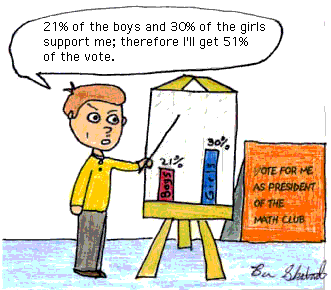
    In the research article the authors make it clear that the model was calibrated so that it successfully predicts the outcome of each election going back to 1980.  But, the news articles from the Denver/Huffington Post reports the model’s accuracy as if it’s been in use since 1980 and has never been wrong in previous efforts to report election results.  This is dangerously misleading.

    If you’ve built a predictive model before you realize that, within reason, you can use a few tricks here and there to have the model work just the way you want it to work.  Now, I’m not saying that the authors from the University of Colorado wanted a model that would forecast a Romney victory.  No.  What I’m saying is that the authors wanted a model that accurately forecast the winner of every previous election in their study.  In other words the historical accuracy of the model wasn’t an accident (“Hey, it turns out that our model – produced in a vacuum – has worked for 30 years!”); rather, the model was developed in order that its forecasts would have been accurate.  Now, the authors of the research don’t make such a claim but the journalists who reported the story fail to clarify how the study should be interpreted.

    So, what’s the point of this blog post?  Well, this type of reporting is potentially dangerous just like early reporting of exit polling results can be dangerous.  This information may influence voters  – they may choose not to vote (for either candidate – a supporter may think his candidate has the election in the bag and doesn’t bother voting or may believe his candidate doesn’t stand a chance and may not vote).  In any case, journalists who report on predictive models, and polling results for that matter, need to have a better understanding of statistics so that they are able to report these studies with greater precision and with appropriate context.  They do their readers a disservice when they report forecasts too loosely.

    In addition, I think the researchers have a responsibility, especially in their capacity as public employees, to clarify how the model was constructed and what they mean, exactly, by stating that it has been correct going back 30 years.  They were clever to publish a study that would garner plenty of media attention and I commend their effort to do salient applied work rather than something more theoretical and obscure.  That said, they should be certain that their research is properly understood by the public they are paid to serve.
     

    Share:
    More
    • 13 years ago
    • Geography
    • Justin
    • cartography
    • geographer
    • geography
    • hall of fame

    Geographer Hall of Fame – Gerardus Mercator

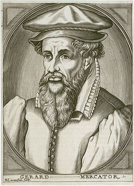
    Joining Waldo Tobler as the second Geographer Hall of Fame inductee is Gerardus Mercator.

    Mercator was a 16th Century cartographer best known for inventing the Mercator projection.  You can read more about Mercator on Wikipedia:

    http://en.wikipedia.org/wiki/Gerardus_Mercator

    http://en.wikipedia.org/wiki/History_of_cartography

    And here are a few related books that may be of interest:

    Mark Monmonier wrote about the Mercator Projection in Rhumb Lines and Map Wars (here’s an excerpt).

    For the serious scholar of cartography, you’ll want to check out the History of Cartography series by J.B. Harley and David Woodward.  There are several volumes including Cartography in the European Renaissance: Part 1 and Part 2.

    Thanks to everyone who voted and submitted nominees!  Stay tuned for the 3rd inductee!

    Share:
    More
    • 13 years ago
    • Geography
    • Justin
    • geographer
    • geography
    • hall of fame

    Geographer Hall of Fame – Submit Your Vote

    In my initial post Waldo Tobler became the first Geographer Hall of Fame inductee.  I received lots of good comments and several submitted names for consideration.  Now I’d like to get reader input for the next inductee.  If you’re interested in participating, please follow the link below to vote for one of the many worthy nominees:

    http://www.surveymonkey.com/s/DLM3C8B

    Also, if you’d like to nominate a geographer for the next round of voting please leave a comment below or Tweet your nominee to me on Twitter (and follow me too): @justinholman.

    Thanks for participating!  I will share the results before the end of July.


    Share:
    More
    • 13 years ago
    • Geography
    • Justin
    • Colorado Springs
    • evacuation
    • mandatory
    • map
    • waldo canyon fire

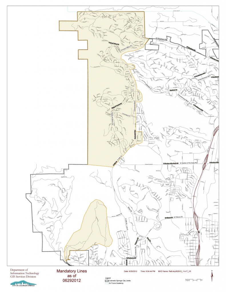
    Waldo Canyon Fire Mandatory Evacuation Map

    I was having trouble downloading the PDF version of this map so I’m posting a smaller jpg version here in hopes that it might help someone struggling to access this information.  This map will be more difficult to read but you should be able to click on the image and then zoom in using browser controls.  If you’re familiar with the Colorado Springs road network you should be able to identify your neighborhood.  The shaded area is still under mandatory evacuation notice.

    Big kudos to the Colorado Springs GIS department who must be working around the clock to keep up with demand for their mapping and analytical services.

    Share:
    More
    • 13 years ago
    • Geography
    • Justin
    • cartography
    • contest
    • map
    • rodney dangerfield

    Caption Contest: What Would Rodney Dangerfield Say About this Map

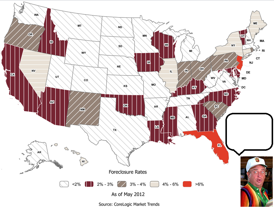
    Imagine that Rodney Dangerfield was a cartographer.  What would he say about this map?  Please submit your caption idea and I will select a winner on Monday.


    Full press release from CoreLogic with graphics can be found on PR Newswire.

    Share:
    More
    • 13 years ago
    • Geography
    • Real Estate
    • Justin
    • Colorado
    • fire
    • map
    • red zones
    • risk
    • wildfire

    Over 1 Million Colorado Residents Live in High Fire Risk Locations

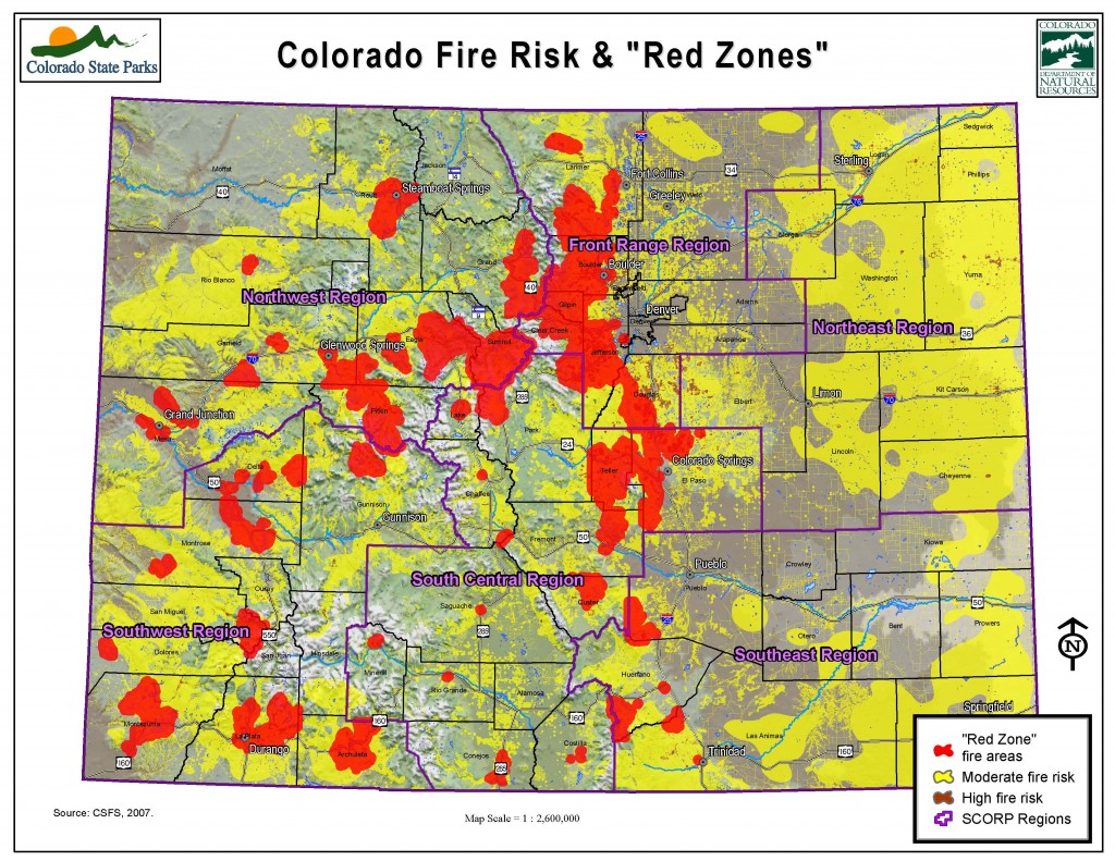
    This year’s explosive wildfire activity in Colorado is a reminder that during the housing boom many people built homes in risk-prone areas of the state.  Today over 1 Million Colorado residents live in a “red zone”, i.e., an area that will eventually, inevitably see wildfire activity.  Millions more live in locations with moderate risk.  Here’s a map of fire risk in Colorado.

    Here’s a link to the source: http://www.parks.state.co.us/SiteCollectionImages/parks/Programs/LWCF/SCORP/Statewide_fire_risk_final.pdf


    Share:
    More
    • 13 years ago
    • Geography
    • Justin
    • cartography
    • geography
    • map
    • politics
    • vote

    The Geography of Voter ROI

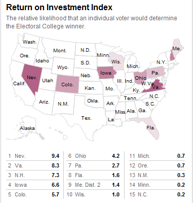
    Terrific map from Nate Silver’s Five Thirty Eight blog at the New York Times.  Apparently my move from Michigan to Colorado increased the value of my vote significantly.  The map is interactive so if you visit the Five Thirty Eight blog and find the map you can mouse over your state and see how important your vote might be in November.

    Share:
    More
    • 13 years ago
    • Education
    • Geography
    • Justin
    • career
    • Colorado
    • computer science
    • geography
    • geospatial
    • job
    • spatial

    Postdoctoral Research or Software Engineering Position, Computational Landscape Modeling, University of Colorado, Boulder

    Interesting job post appeared in my inbox.  Check it out:

    Postdoctoral Research or Software Engineering Position, Computational Landscape Modeling, University of Colorado, Boulder. Applications are invited for either a post-doctoral researcher with a background in the Earth Sciences and in scientific software development, or a software engineer with experience in geoscience modeling. The successful candidate will be based at the University of Colorado, Boulder, and will collaborate with a team of scientists at Tulane University, the University of Washington, and the University of New Mexico. The project entails building stand-alone software components that can be linked to explore different questions about landscape evolution over various spatial and temporal scales. The researcher will be responsible for helping to design, implement and test software, and coordinate amongst team members. The position requires knowledge of an open-source, object-oriented programming language. Experience in C++ is especially desirable, as is a background in geomorphology or hydrology, and/or experience with model-coupling frameworks. The position will have the support of the Community Surface Dynamics Modeling System (CSDMS) infrastructure, based in Boulder, Colorado. Some travel to work with team members at different Universities will be necessary. The position is available starting in late summer or early autumn 2012. Initial funding is for one year, although the position may be extended for an additional year based on performance. To apply, please send a CV including contacts for three references and a cover letter that describes your experience with software development and numerical modeling to Greg Tucker, gtucker@colorado.edu. Priority will be given to applications received before July 23, 2012.

    Share:
    More
    • 13 years ago
    • Geography
    • Justin
    • cartography
    • climate
    • geography

    Duke University Climate Change Researchers Fail Geography 101

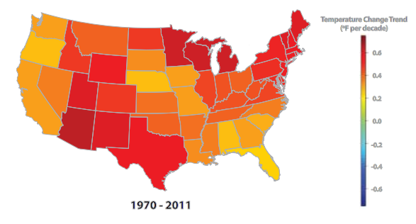
    I read a recent report from Climate Central that attempts to illustrate temperature change in the US.  You can find the report here.  I’ll keep my review brief: I think it sucks.  The main reason I don’t like the report is because the researchers decided to aggregate temperature change by State.

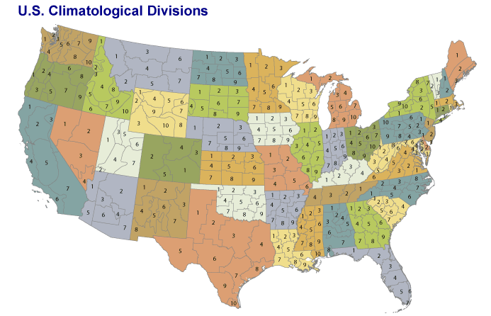
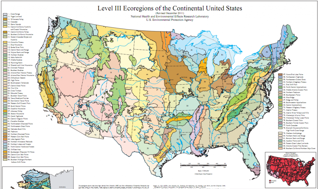
    Why is this a problem?  It doesn’t make any sense to map these data by State.  Why couldn’t the researchers have taken a little time to think about an appropriate geographical scale?  A quick web search using keywords “map” + “climate” would have revealed that there is an existing geography for these data called U.S. Climate Divisions.  The US Climate Divisions aren’t ideal so they could have used Level III or IV Ecoregions or perhaps interpolated the data onto a high resolution spatial grid and created an animation.  Or they could have called or emailed a geographer who knew what they were doing instead of stumbling blind into geographical data analysis.  They could have placed a call to Glen Macdonald at UCLA who published a terrific report on drought in the US Southwest with maps of temperature change and drought indices in the US.  There are dozens of other researchers who could have helped them create a good map.  But, in the age of Google Maps everyone thinks they’re an accomplished cartographer.

    By the way, their rainbow color scheme is problematic as well.  They should check with Cindy Brewer for guidance on how to select a map color scheme.

    Here’s the map produced by Climate Central:

    Here’s are three better options for mapping US climate data:


    Click on any of the 3 images above to link to the source.  The last map above is one of several images that form an animation of climate simulations in the Pacific Northwest.  The animation is used by in a Climatology course at the University of Oregon.

    Using the US Climate Divisions or Ecoregions or a high resolution grid would have allowed the researchers to produce a much more nuanced and informative map.  Aggregating these data by State is an oversimplification that likely disguises important spatial patterns of change and may be misleading readers.

    I noticed that the 2 PhDs who were listed as authors on the report are affiliated with Duke University.  Duke is obviously an excellent university but, like many universities in the United States, it has chosen not to offer a Department of Geography.  What a shame.

    Share:
    More
    • 13 years ago
    • Business
    • Education
    • Geography
    • Justin
    • career
    • education
    • geography
    • geospatial
    • GIS
    • spatial

    Geospatial Career Q&A with Undergraduate Part 4 – Long Term Career Planning

    In Part 1, I posted a line of questioning I received from a soon-to-graduate geography major.  My response is in 3 parts: (1) summer suggestions, (2) hitting the job market next year, and (3) long-term (3-5 years) career positioning.  In Part 2 I provided suggestions for what to do this summer.  In Part 3 I cover hitting the job market.  You’ll want to go back and read Part 1, Part 2 and Part 3 if you haven’t already.  This will be my last post in this series.

    Long term career planning can be daunting.  Here’s my approach in 4 simple steps.

    Step 1. Don’t think beyond 5 years into the future.  How can you plan for your entire career with technology and the economy changing so rapidly?  You can’t.  It’s too hard.  Look how much the world has changed in the past 5 years.  In 2007 you might have thought that a finance job at Lehman Brothers would fulfill all your dreams.  Or perhaps a career as a high-flying mortgage broker sounded attractive.  Not so much today.  Five years is about right – if you decide to go into medicine then 5 years is a far enough to think through med school and the beginning of residency or something comparable for other medical paths.  Same for legal careers, teaching, etc.  And the same goes for geospatial careers.  Looking beyond 5 years is a waste of time because there are too many contingencies that are unpredictable.  By the way, planning for 1, 2, 3 or 4 years out is fine too if that works better for you.

    Step 2. Visualize where you want to be in 5 years.  Where do you want to live?  What do you want to be doing?  Who do you want to be spending time with?  What will you need to get there?  Write it down!  More detail is better.  Try to paint as complete a picture as possible.  And focus on what you will actually do with your time rather than what title you will hold.  If you can’t commit to one particular vision then write down multiple possible futures.  Dream big!  Don’t settle for something that sounds okay.  Might as well go for it – you only make the trip once, right?

    Step 3. Remind yourself of your vision(s) frequently.  Once you have one or more detailed descriptions of your vision for 5 years in the future create an index card with a handful of bullet points that will allow you to conjure the vision in your head.  Put it in your sock drawer or on your bathroom mirror or have it appear on your laptop’s desktop or cell phone screen – whatever works for you.  The idea here is just to keep your long-term goals fresh in your head.

    Step 4. Take action to make your vision a reality.  If the vision stays in your head you’ll be able to take small steps, perhaps even unconsciously, to move closer to your long-term goals.  The key, as I discussed in Part 3, is to take action.  Don’t over-think and suffer from analysis paralysis.  Try lots of different stuff and see what sticks, then build on it.  Or start over if you need to.  It might feel like every decision you make is irreversible and catastrophic if it doesn’t work out perfectly.  Wrong!  You will make mistakes, lots of them.  Embrace it.  You won’t get anywhere without making lots of mistakes.  Learning to fail frequently is a pretty good strategy.  It’s sort of like a multiple-choice test; it’s often better to eliminate some of the choices rather than only searching for the “correct” answer.  There are no bad decisions.

    Good luck!  And let me know if I can help.

    Share:
    More

    Posts pagination

    1 … 11 12 13 … 17

    Archives

    Popular Posts

    • Why Relocate to Pueblo Colorado
    • The 3 Lessons I Learned After Accidentally Buying a Liquor Store
    • 2014 Rankings - Top 10 Graduate GIS Programs
    • 2015 Rankings - Top Graduate Geography Programs for Spatial Careers
    • 2017 Geography Graduate Program Rankings

    Recent Posts

    • An Ode to My Students
    • Forecasting Confirmed COVID-19 Cases
    • Climate Anomalies and Aftermarket Part Sales
    • Weather and Climate Data for the Automotive Aftermarket
    • Technology Jobs in Pueblo

    Recent Comments

    • Joe on Lesson 2: World Regions and Theories of Uneven Economic Development
    • Justin on Pueblo Neighborhoods 1.0
    • Raj on The 3 Lessons I Learned After Accidentally Buying a Liquor Store
    • Maggie on Pueblo Neighborhoods 1.0
    • Justin on Pueblo Neighborhoods 1.0

    © Geographical Perspectives, 2017

    Site Managed by Gecko Designs

    Forget password?

    What are you looking for?