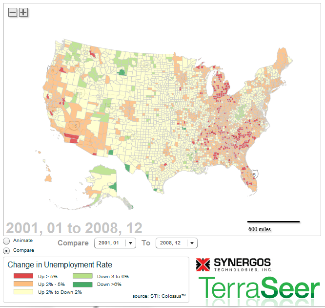
Visualizing Unemployment Dynamics – Animate and Compare Time Periods
Last week I posted a map illustrating changes in Home Price Indices over the past 5 years. I had one comment on LinkedIn looking for a similar map for unemployment data. This is a different type of map using an older version of TerraSeer’s web mapping technology. The static map below shows county-level unemployment change between Jan 2001 and Dec 2008. You can animate unemployment rates between 1990 and 2010 or compare a custom time period (toggle from “animate” to “compare” – see lower left radio buttons) on the interactive map at TerraSeer. Unemployment data provided by Synergos Technologies. I welcome any feedback!

Do you have data you’d like animated? Or would you like to be able to create map comparisons easily? Let me know! I’d love to help!