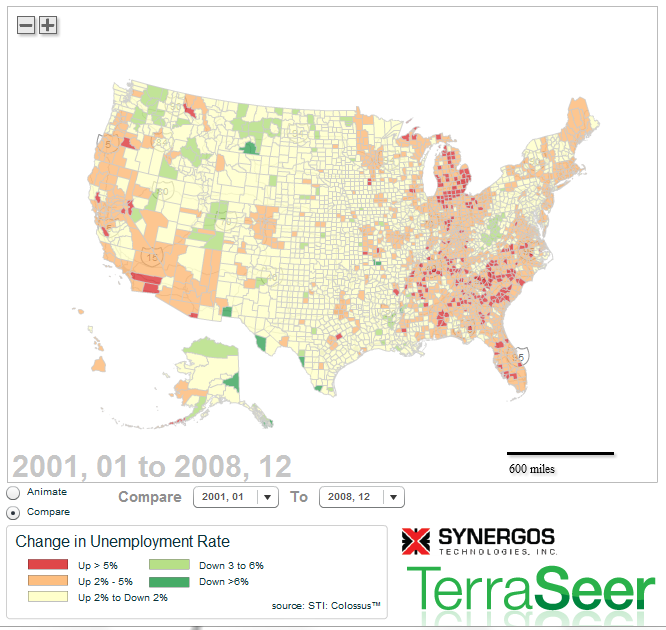
Visualizing Unemployment Dynamics – Animate and Compare Time Periods
March 7, 2012
Last week I posted a map illustrating changes in Home Price Indices over the past 5 years. I had one comment on LinkedIn looking for a similar map for unemployment data. This is a different type of map using an older version of TerraSeer’s web mapping technology. The static map below shows county-level unemployment change between Jan 2001 and Dec 2008. You can animate unemployment rates between 1990 and 2010 or compare a custom time period (toggle from “animate” to “compare” – see lower left radio buttons) on the interactive map at TerraSeer. Unemployment data provided by Synergos Technologies. I welcome any feedback!

Do you have data you’d like animated? Or would you like to be able to create map comparisons easily? Let me know! I’d love to help!

4 Comments
Justin, I’m so very much enjoying your blogs. Despite my territory of real estate being in the biggest pile of doo doo.. Practical application moves us closer to solutions. Anyway, seeing the list and the map makes it a bit more real.
I’m constantly thinking about medical applications. I’ll get back to you..
Thanks for sharing
Shana
Thank you Shana Banana! A medical application sounds great!
Wow. Very cool to be able to alter the time period. Vs similar static maps found in a typical article.
Look forward to getting back in school for this.
Thanks for the comments, Dave! Best wishes, JH