Bad UV map hurts melanoma risk screening
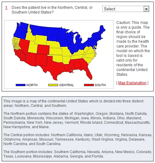
A few years ago I tried my hand at writing a few NIH grant proposals. I struck out. I had a couple applications scored but none were funded and they didn’t really come very close. In any case, while I was researching my topic I came across the map below on the National Cancer Institute’s website:

Along with this map and question they provide an explanation:
Question 1:
Does the patient live in the Northern, Central, or Southern United States?
Explanation
Melanoma is more common in people who live in areas that get large amounts of UV radiation from the sun. For example, melanoma is more common in California than in Minnesota, where the sun is not as strong.
Now I’m sure the authors of this screening tool are extraordinarily intelligent people. They probably know everything about microbiology and cancer etiology and they probably kicked my butt in biology, chemistry and every other science class in high school and college. But, couldn’t they have looked at the geographic distribution of UV before they produced this kindergarten map?