Health Insurance Price Discrimination in Colorado?
As if the rollout of Obamacare wasn’t sufficiently disastrous, we can now add the possibility of price discrimination to the growing list of problems with the new and chaotic health insurance landscape. In a recent news story (“Exchange Rates Higher Here” by Dennis Darrow, Pueblo Chieftain, November 3, 2013), I learned about the Colorado Division of Insurance’s geographical ratings and saw the Map of Health Insurance Rating Areas for Colorado. Maps always grab my attention and the spatial pattern I saw looked suspicious. According to the Colorado Insurance Commissioner, Marguerite Salazar, “Geographic rating areas are needed as health care costs are different for different areas.”
I browsed to the Colorado Division of Insurance’s web page to find out what criteria were used to determine the geographical ratings. I didn’t find any explanation or price setting methodology. What I did find is the Pueblo Health Insurance Study published in January 2009 and based on data collected from 2003 through 2006. One of the key findings was the following: “Individual health insurance claim costs were significantly lower in Pueblo than in either Weld or Denver.” Wait….then why are the recently published individual premiums for Pueblo ($223) priced 20-25% higher than the individual premiums for Weld ($177) and Denver ($186)?
You want to know what else I learned? The Colorado Division of Insurance had the option to simply establish one rating for the entire state. Why wouldn’t they do that? Wouldn’t it be nice to keep it simple? Communication with the public would be easier. Web content and other advertising – easier. Menu of plan options and associated costs – just one for the state vs 11 different menus? So, what was it that made geographical ratings worth the increased complexity and associated administrative costs? It’s not clear to me but I suspect that it’s driven by health insurers profit motives.
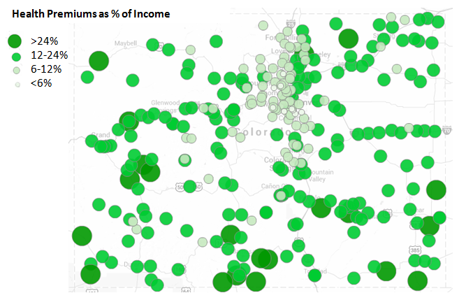
The only documentation I found attempts to explain why premiums are higher in mountain resort areas: Fact Sheet- Colorado Geographic Rating Requirements in Mountain Resort Counties. No mention of the rural communities in the far corners of the state and what contributes to their high rates. When I looked at the map it appeared to me that premium rates are primarily a function of proximity to Denver. The closer to Denver you live, the lower your health insurance premiums, especially if you look at premiums as a % of income (see the map below displaying annual health premiums as a % of annual per capita income). No wonder some counties want to secede.

Here’s the raw data represented in the map above: ColoMuniPremPctIncome (csv format). Data sources include US Census Bureau and the Colorado Division of Insurance.
I think the Colorado Division of Insurance should produce a more detailed explanation or, better yet, a transparent look at the formula that was used to determine geographical rating areas and corresponding rates.