Math TCAP Performance Highly Correlated with % Free-Reduced Lunch
In my initial post on the topic of TCAP scores I pointed out that Pueblo District 60 Schools (D60) have more students who qualify for Free Lunch than the total number of students in all of Pueblo County District 70 (D70). I also said D60 has a more difficult task not only due to the fact that they are a much larger school district overall but also because D60 students come from households with far lower incomes, on average.
Some readers may not be convinced that lower economic status translates into lower test scores. Let’s see if I can convince those folks that there is indeed a strong relationship between household income and academic performance.
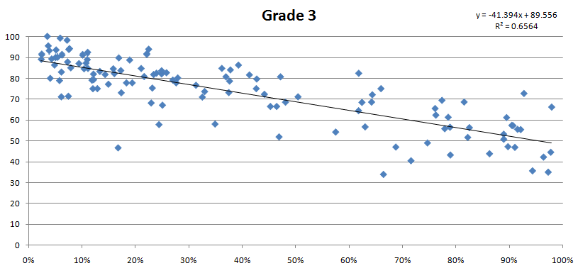
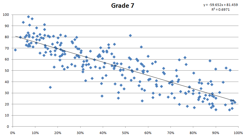
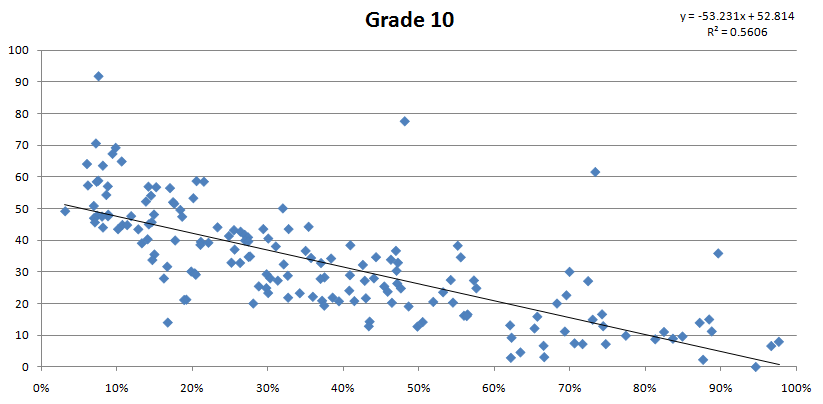
Rather than focusing on Pueblo Schools I want to look at a bigger picture to better understand the relationship between test performance and economic status on a State-wide basis. So these data displayed in the charts below cover all over Colorado’s public schools. Many schools have too few test takers to be considered statistically significant so those small schools were eliminated from the data set. I also limited data selection to 3rd grade, 7th grade and 10th grade. These grade levels are the middle grade (or close to it) for typical elementary, middle and high schools, so I think it’s an appropriate subset to explore. If I look at every grade level I worry the quantity of data displayed starts to become too much to digest. In addition, I’m only looking at Math scores and, for now, omitting Reading and Writing scores for two reasons. First, again, it’s difficult to look at too much data all at once and might lead to confusion. Second, in my opinion, Math scores tend to minimize cultural bias and, as such, provide a more accurate reflection of actual academic capability.
On each of the charts below the horizontal (x) axis represents the percentage of students who qualify for Free or Reduced Lunch programs. The vertical (y) axis represents the Math TCAP test score results. Each point on the chart represents one school’s Math TCAP scores and their corresponding % of students who are eligible for Free or Reduced Lunch. I’ve also included a trend line with the associated regression equation and R-Squared value (included in the upper right corner of each chart). Don’t worry if the equations make you nervous – these details are only there for reference.


As the charts clearly illustrate, or at least they clearly illustrate this to me, there is a very strong relationship between economic status and TCAP Math performance. As % Free-Reduced Lunch goes up, school TCAP Math performance goes down. Given the strength and consistency of this relationship, School District evaluation efforts and media coverage of local school performance results should focus on school performance within this context.
Furthermore, instead of blaming public school systems for failing our children perhaps we should consider blaming socioeconomic policy for producing too many students who are too hungry to succeed in school.
Read the Previous Post in this Series | Read the Next Post in this Series
