Duke University Climate Change Researchers Fail Geography 101
June 26, 2012
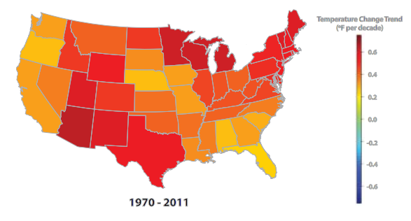
I read a recent report from Climate Central that attempts to illustrate temperature change in the US. You can find the report here. I’ll keep my review brief: I think it sucks. The main reason I don’t like the report is because the researchers decided to aggregate temperature change by State.
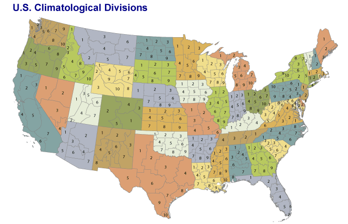
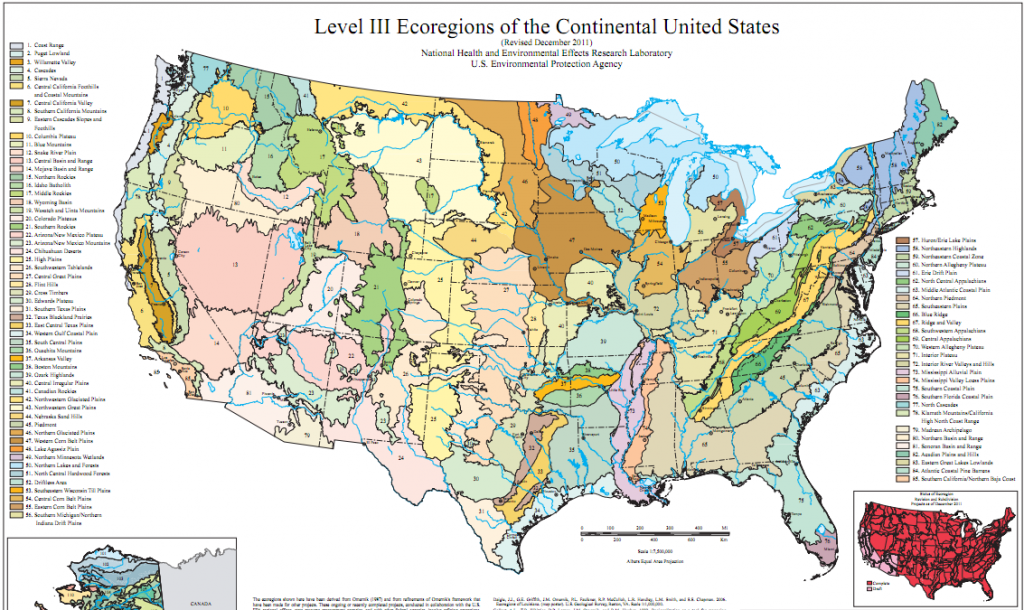
Why is this a problem? It doesn’t make any sense to map these data by State. Why couldn’t the researchers have taken a little time to think about an appropriate geographical scale? A quick web search using keywords “map” + “climate” would have revealed that there is an existing geography for these data called U.S. Climate Divisions. The US Climate Divisions aren’t ideal so they could have used Level III or IV Ecoregions or perhaps interpolated the data onto a high resolution spatial grid and created an animation. Or they could have called or emailed a geographer who knew what they were doing instead of stumbling blind into geographical data analysis. They could have placed a call to Glen Macdonald at UCLA who published a terrific report on drought in the US Southwest with maps of temperature change and drought indices in the US. There are dozens of other researchers who could have helped them create a good map. But, in the age of Google Maps everyone thinks they’re an accomplished cartographer.
By the way, their rainbow color scheme is problematic as well. They should check with Cindy Brewer for guidance on how to select a map color scheme.
Here’s the map produced by Climate Central:

Here’s are three better options for mapping US climate data:


Click on any of the 3 images above to link to the source. The last map above is one of several images that form an animation of climate simulations in the Pacific Northwest. The animation is used by in a Climatology course at the University of Oregon.
Using the US Climate Divisions or Ecoregions or a high resolution grid would have allowed the researchers to produce a much more nuanced and informative map. Aggregating these data by State is an oversimplification that likely disguises important spatial patterns of change and may be misleading readers.
I noticed that the 2 PhDs who were listed as authors on the report are affiliated with Duke University. Duke is obviously an excellent university but, like many universities in the United States, it has chosen not to offer a Department of Geography. What a shame.
5 Comments
Justin,
I am in recovery from concussions resulting from going head-to-head with my bud from high school who clings to the ‘notion’ that Global Warming is a Myth (doesn’t know how to spell endangered species). Much as I can feel your pain about the quality of their initial maps, right off the bat, we are not at a point where doing the stuff that you are suggesting by grouping data into Climatological Zones is just not going to win the election for Obama. Really. That 1st map is not a total failure. Ok, a little tweaking would be nice, but for the most part, if we can just get it to scream something that would make an 18 ft SUV driver think twice, then that’s the first step towards opening a door to the progress in the mindset of this nation that wants to be obese with apathy about an issue like this.
Dan, thanks for the comment. I think we’re on the same page in regards to global warming – the science is pretty clear. But, I completely disagree with your implication that it’s better to dumb-down research or massage data to make a political statement or to paint a more dramatic picture that might lead to action. Doesn’t that basically put you in the same boat as Hannity, Limbaugh and other far-right “pundits” who ignore credible evidence in order to advance their own political agenda? The 1st map is indeed a failure, in my opinion, because it’s totally misleading. Maybe weather.com should just start reporting on a state-by-state basis, “The high today in Texas will be 95 degrees with a low of 55 degrees and a 30% chance of rain. This represents an average for the entire state so please step outside to check your local forecast.” I realize this example is a bit over-dramatic, and perhaps overly sarcastic, but in my view state-level temperature change maps are equally absurd. Cheers, J.
[…] Terrible map by Duke Climate Researchers. I had to call out these researchers for failing to even think about basic geography concepts […]
Hi Justin,
I like your posts a lot. This in particular is quite intriguing as it’s really hard to understand the lack of logic by creating a map using temp. data constrained into polygonal features named states, climatological divisions, or ecological regions (unless all the values collected in each state by the meteorological stations are the same and unique over the years!). In my opinion the only right way to display a map depicting temperature change is by an interpolated grid. Putting temperature data into polygons that depict an specific phenomena (including the climatic divisions) is wrong.
Juan-Paulo – thanks for sharing your feedback! I agree with your preference for an interpolated grid. Best, Justin